More designs posted regularly here.
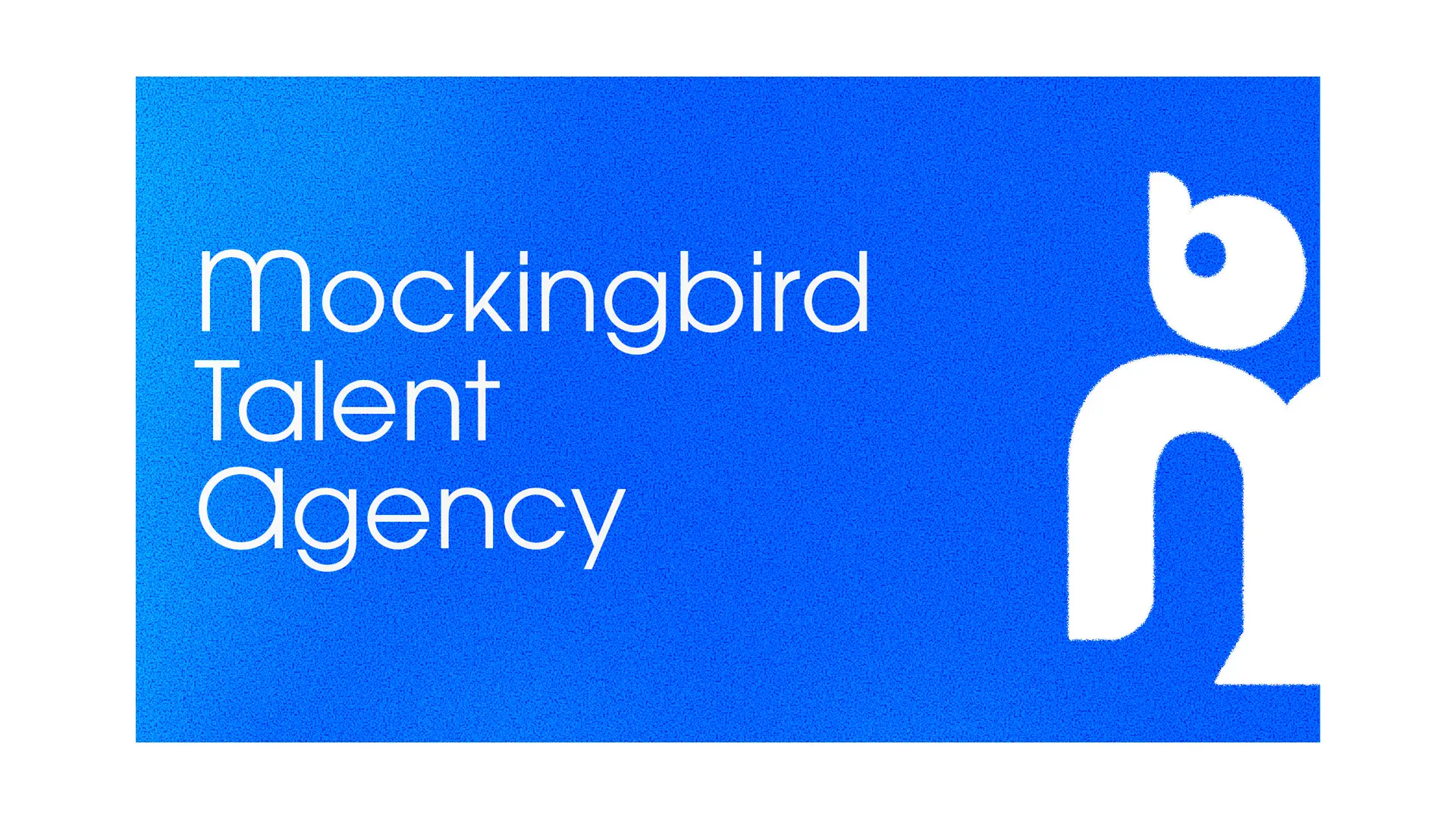
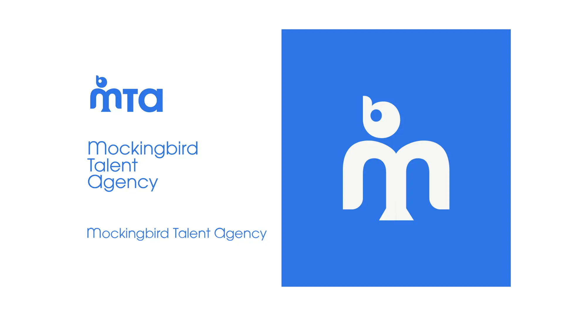
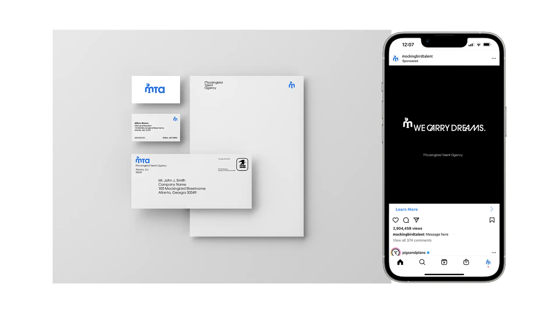
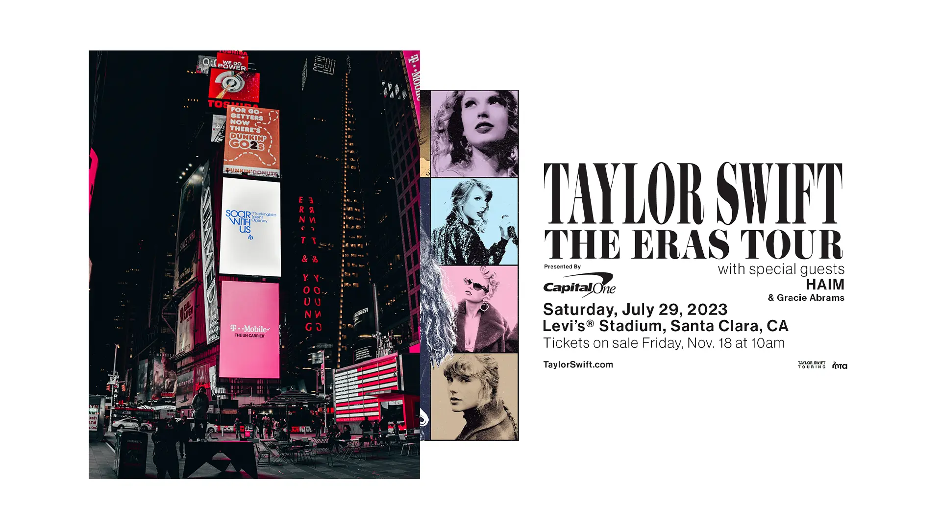
Mockingbird Talent Agency (MTA) is band booking and branding agency built by a creative (singer/songwriter Atticus Roness) for creatives. MTA wanted to unveil an innovative brand of transparency, creativity, and trust.
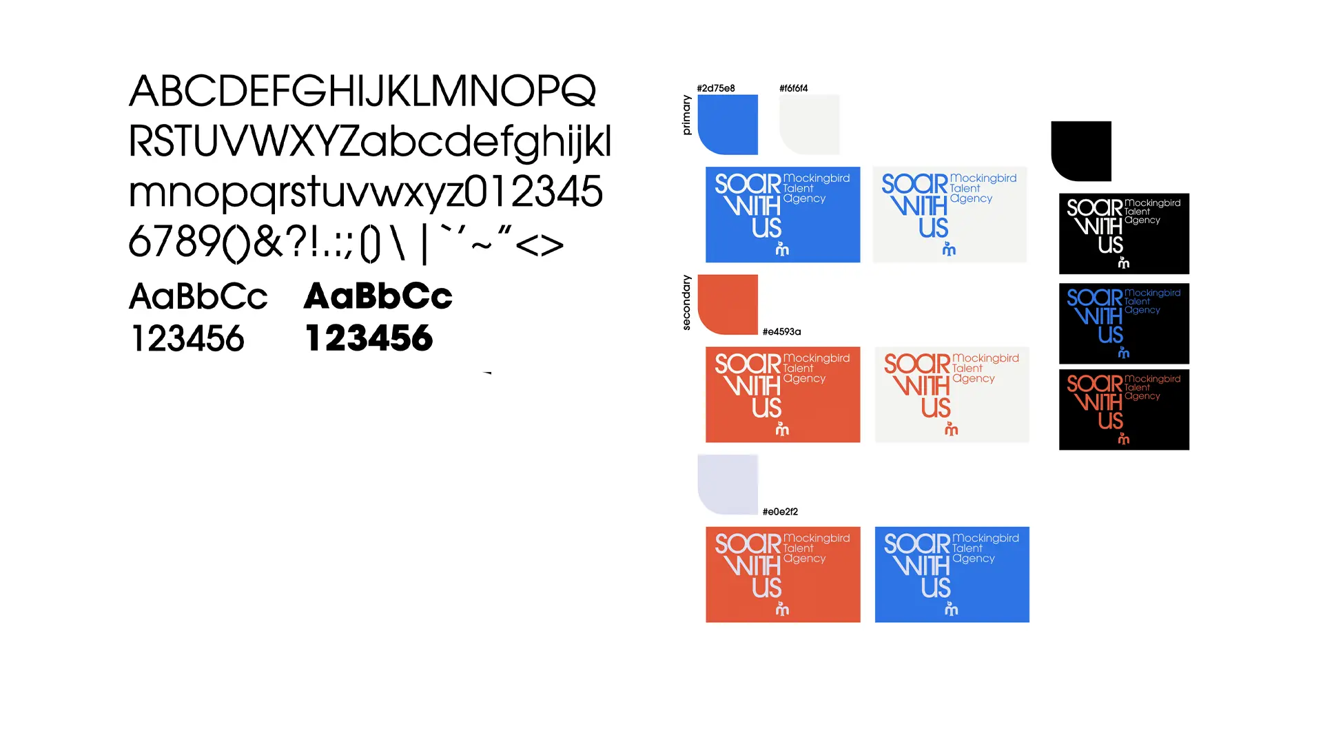
For MTA's launch I aimed to blend the professionial and industrial look of the industry competitors with an emphasis on the creativity Atticus would bring to his service being an artist himself. All the elements in this identity package take a very clean, trustworthy, professional feel and gives them just a slight creative twist like the glyphs in the font, the "MB" being made into a bird brandmark, and the orange secondary color to create direct harmony to the main blue color of the brand.
To learn of more ways I achieved this identity, take a look at the brand strategy guide.
Big Shanty is a bedroom-pop artist based in Atlanta, GA. He seeks to pursue and capture new and unfamiliar combinations of sounds.
With the motion graphics I aimed to capture the sonically and lyrically mysterious atmosphere created in “Waterfall”. The flow of the gradients represent the continuous flow of a waterfall, the black dark atmosphere represents not experiencing one as mentioned in the song.
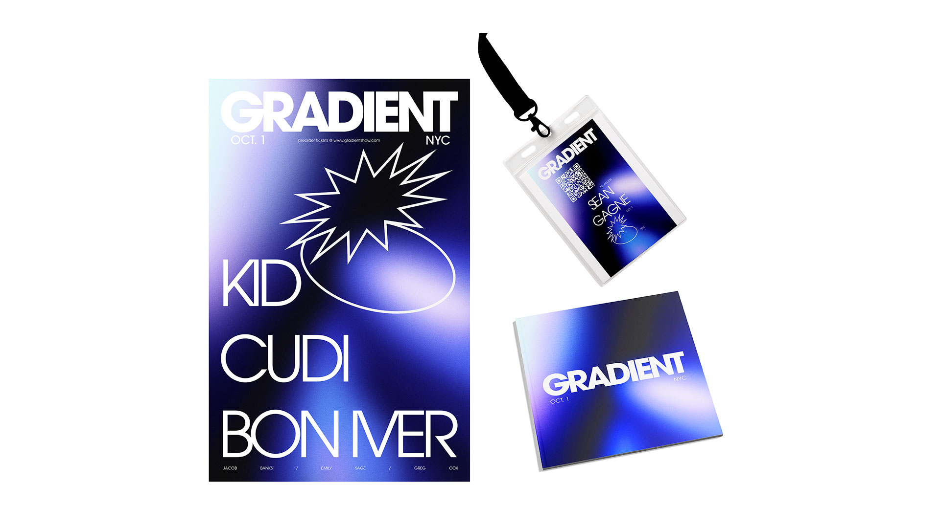
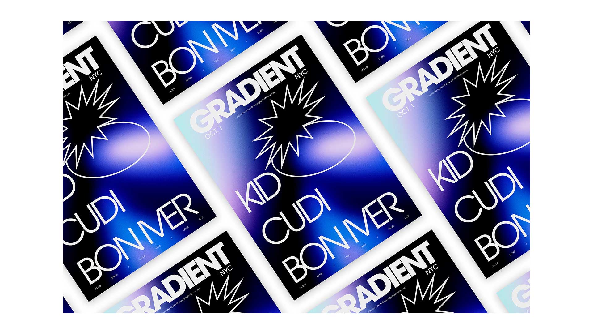
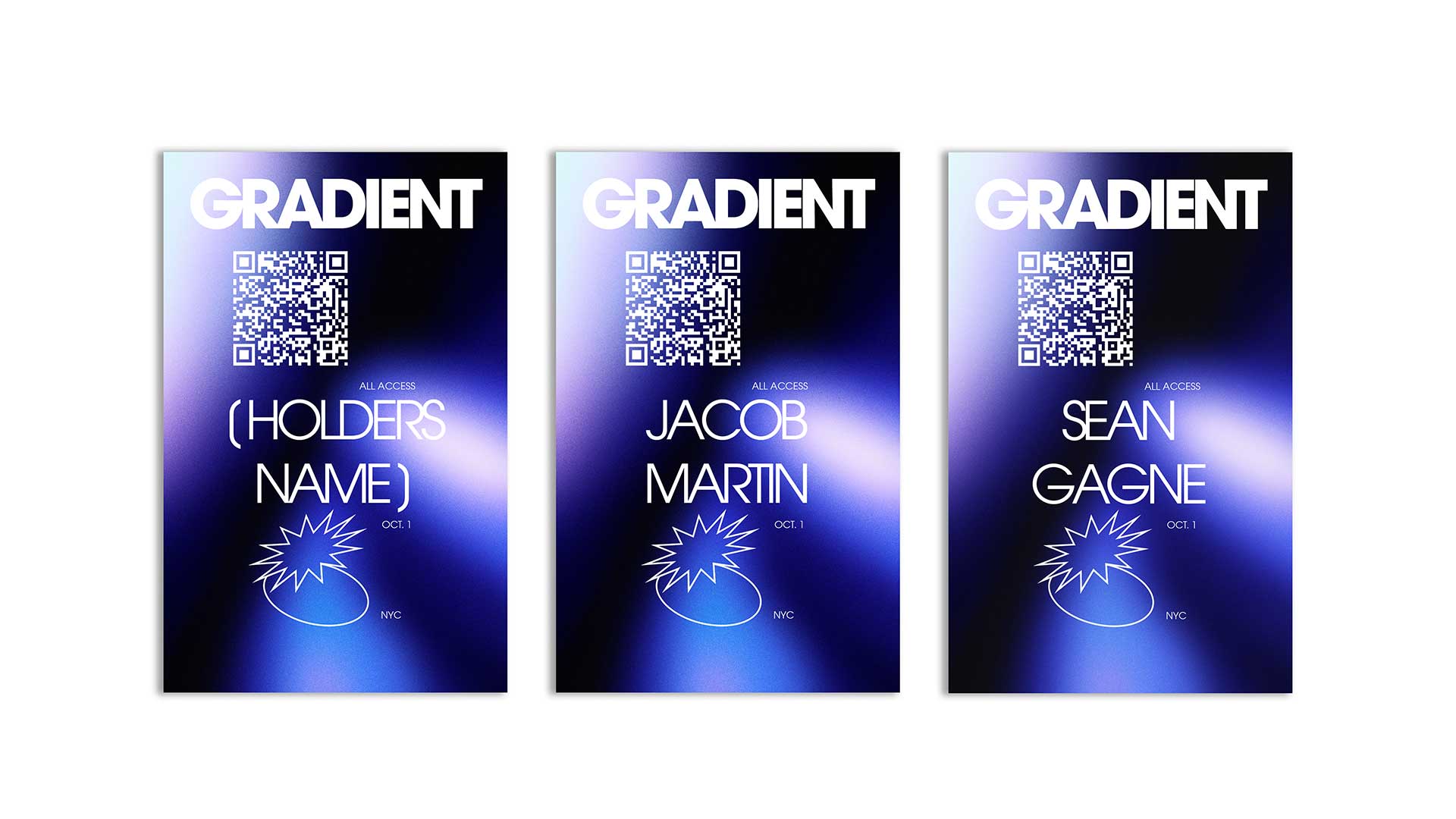
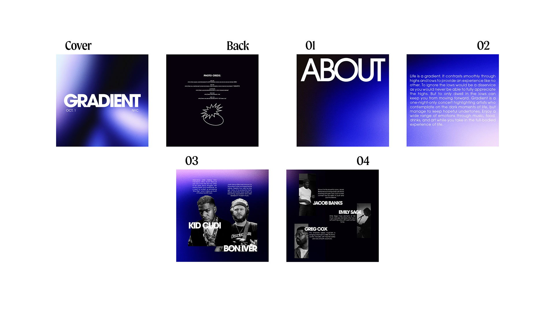
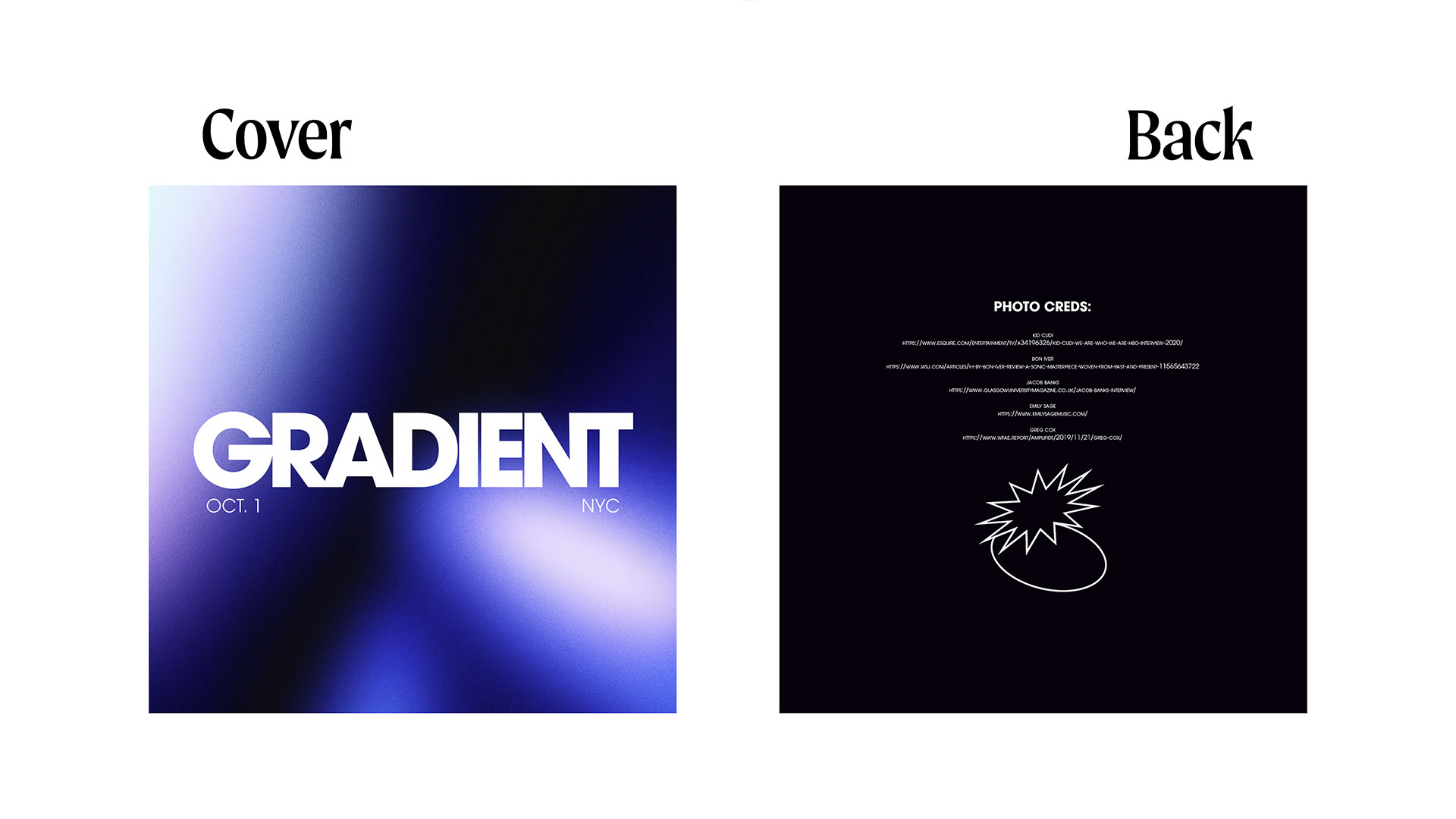

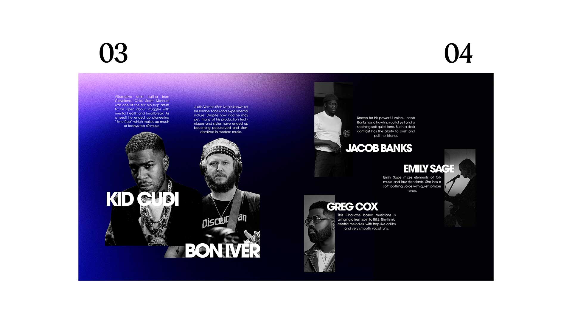
Gradient is the result of a final exam school project from my time at Maryville University. Students were tasked to utilize Photoshop, Illustrator, and Indesign to create a brand identity, poster, booklet, and tickets for a fictional concert.
I decided to create a music festival called “Gradient”, drawing inspiration from a playlist I made earlier that semester. The playlist was a curation of artists I noticed made songs tackling tough and dark subjects, but always with a sense of hope and moving forward. The contrast between the light and dark within the same sonic and thematic setting inspired the name “Gradient”.
With the title “Gradient” it was pretty obvious which direction to take the design. Because of the “dark to light” theme I wanted the gradient used in the design to go from black to white with, at most, a slight hue added to both values, but extreme contrast must be presented. Most of the artists on the playlist (and therefore chosen for the project) have a somewhat minimalist sound so I decided to use a monochromatic scheme. I chose to stay within the blue hue to match the bluesy-ness of the artists represented. For the typography I went with one classic serif with different weights to compliment and really drive the minimalist theme. I feel the minimalism really amplifies the contrast and helps to push the “light surrounded by dark” feeling.